
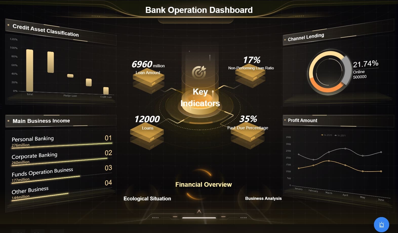
Apps are part of our daily life. We use them to study, shop, chat, work, and manage money. But many apps feel confusing when we first open them. Too many buttons. Too many menus. Too much data. That is why the core app dashboard matters so much. It brings order to chaos. It shows the most important things first. It helps users feel calm and in control. A strong core app dashboard is not just a screen. It is the brain of the app. It guides users. It saves time. It improves results. When designed well, it turns a complex system into something simple and easy to use. In this detailed guide, you will learn what a core app dashboard is, why it matters, what features it must have, and how to design one that users truly enjoy using.
What Is a Core App Dashboard?
A core app dashboard is the main control screen of an application where users can see key information, track performance, and quickly take action without digging through multiple pages. It works like a command center. When users log in, they land here first. This page displays summaries, alerts, charts, updates, and shortcuts. Instead of forcing users to search for data, the core app dashboard brings everything together in one place. It organizes important details in a clear layout. Because of this, users understand what is happening right away. They do not waste time. They do not feel confused. A well-designed core app dashboard improves user experience, increases productivity, and builds trust in the app.
The core app dashboard also adapts to different types of apps. For example, a finance app may show balance, expenses, and savings goals. A fitness app may display steps, calories, and workout history. A business tool may highlight sales, tasks, and team progress. Even though the data changes, the purpose stays the same. The core app dashboard always focuses on clarity, speed, and usability. It presents the most valuable information in a simple format so users can act quickly.
Why a Core App Dashboard Is So Important
A core app dashboard plays a huge role in user satisfaction because it creates the first impression. When users open an app and immediately understand what to do, they feel confident. On the other hand, if they feel lost, they may close the app and never return. Therefore, the core app dashboard directly affects user retention and engagement. It helps users stay longer and interact more.
Moreover, a strong core app dashboard improves decision-making. When data is organized clearly, users can spot trends and problems fast. They can compare numbers. They can see progress. They can identify what needs attention. This saves time and reduces mistakes. Instead of guessing, users rely on visual insights. Charts, graphs, and summary boxes make complex data easy to understand.
Another reason the core app dashboard matters is efficiency. It reduces the number of clicks needed to complete tasks. Users can access shortcuts and tools directly from the main screen. This smooth flow keeps productivity high. Whether someone manages projects or tracks personal goals, the core app dashboard keeps everything moving forward.
Key Features of a Great Core App Dashboard
A powerful core app dashboard includes specific features that improve usability and clarity. First, it displays essential metrics at the top. These metrics highlight the most important numbers. They give users a quick overview of performance. Without scrolling, users can understand the current status.
Second, visual elements make the core app dashboard stronger. Charts and graphs turn raw data into pictures. Pictures are easier to understand than long tables. For example, a line chart shows growth over time. A bar chart compares categories. These visuals help users think faster.
Third, customization is very important. Different users care about different data. Therefore, a flexible core app dashboard allows users to move widgets, hide sections, or choose what they want to see. This creates a personal experience. It makes the dashboard more useful.
Fourth, alerts and notifications keep users informed. A core app dashboard should highlight urgent issues. For example, low inventory, missed deadlines, or unusual spending. These alerts help users take action quickly before small problems become big ones.
Finally, navigation shortcuts improve speed. A good core app dashboard includes quick links to popular tools. Instead of searching through menus, users click once and continue working. This reduces frustration and increases satisfaction.
How to Design a User-Friendly Core App Dashboard
Designing a strong core app dashboard requires planning. First, understand your users. Ask what information they need daily. Remove everything that feels unnecessary. Keep only what adds value. Simplicity always wins.
Next, organize content using a clear structure. Place the most important information at the top. Group similar items together. Use consistent spacing and alignment. A clean layout makes the core app dashboard easier to scan. Users should find answers within seconds.
Color choice also matters. Use colors to guide attention. For example, green for success and red for warnings. However, avoid using too many bright colors. Too many colors create confusion. A simple color scheme improves focus.
Responsiveness is another key factor. Many users open apps on phones or tablets. Therefore, the core app dashboard must adapt to different screen sizes. Elements should resize properly. Text should remain readable. Buttons should stay easy to tap.
Testing improves results. After designing the core app dashboard, collect feedback. Watch how users interact with it. Notice where they hesitate. Then adjust the layout. Small improvements make a big difference over time.
Benefits of Using a Core App Dashboard for Business
Businesses gain many advantages from a strong core app dashboard. First, it improves transparency. Teams see real-time data. Managers track progress instantly. Everyone stays informed.
Second, it increases productivity. Employees do not waste time searching for reports. They see everything on one screen. This faster workflow saves hours each week.
Third, the core app dashboard supports better strategy. Leaders analyze trends. They identify growth areas. They adjust plans based on accurate data. Because information is clear, decisions become smarter.
Fourth, it improves customer satisfaction. When businesses respond quickly to issues, customers notice. A core app dashboard highlights problems early. Therefore, teams solve them faster.
Finally, it strengthens accountability. When performance metrics are visible, everyone understands their goals. This encourages responsibility and teamwork.
Common Mistakes to Avoid in a Core App Dashboard
Even though dashboards are powerful, mistakes can reduce their value. One common mistake is overcrowding. When too many widgets fill the screen, users feel overwhelmed. Instead, focus only on essential data.
Another mistake is poor data hierarchy. If important metrics hide at the bottom, users miss them. Always prioritize key information at the top of the core app dashboard.
Slow loading time also harms experience. Heavy graphics and large files reduce speed. Optimize performance to keep the dashboard smooth.
Ignoring mobile design creates problems too. Many users rely on smartphones. If the core app dashboard does not adapt, usability drops.
Finally, lack of updates weakens trust. If data is outdated, users question accuracy. Therefore, always keep the core app dashboard connected to real-time information.
How a Core App Dashboard Improves User Experience
User experience improves when actions feel easy. A core app dashboard reduces mental effort. Users do not need to think hard about where to click. Clear labels guide them.
Visual balance also improves comfort. Proper spacing prevents clutter. Simple fonts improve readability. These small details build confidence.
In addition, the core app dashboard supports focus. Users see priorities instantly. They avoid distractions. They complete tasks faster.
Over time, this smooth interaction builds loyalty. Users return because the app feels helpful. They trust the system. They recommend it to others.
FAQs
1. What is the main goal of a core app dashboard?
The main goal is to show important information in one place so users can act quickly and easily.
2. Can a core app dashboard be customized?
Yes, many dashboards allow users to move widgets, choose metrics, and adjust layout based on their needs.
3. Is a core app dashboard only for business apps?
No, any app can use it. Fitness, education, finance, and gaming apps all benefit from a clear dashboard.
4. Why does design matter in a core app dashboard?
Good design improves clarity, speed, and comfort. Poor design causes confusion and frustration.
5. How often should data update in a core app dashboard?
It should update in real time or at regular intervals to ensure accuracy and reliability.
Conclusion
A core app dashboard is the heart of any application. It organizes information. It guides action. It saves time. When designed with care, it turns complex data into clear insights. It improves productivity. It increases satisfaction. It builds trust. Whether for business or personal use, the core app dashboard shapes the entire user experience. Therefore, focus on clarity, simplicity, speed, and customization. When you do, your app becomes easier to use and far more powerful.
